Rotate and resize until you are happy with the position. Working with the opacity of the top layer lowered can help you match features such as eyes and chins etc to find a good position. When you are happy, | Adjust > sharpness > sharpen | the top layer.
Now Jack's face is rather dark compared with the base image, so we need to lighten him up (the idea of chains not appealing eh, Jack?) I did this using | Adjust > brightness and contrast > brightness/contrast | with the brightness set to 35 and contrast to 8. I then | Adjust > brightness and contrast > highlight/midtone/shadow | and changed the settings to shadow -10, midtone 2 and highlight 2. Jack is still a little red faced at this point (don't be shy, we're all friends here) so I need to take some of that colour out using | Adjust > hue and saturation > hue/saturation/lightness | changing only the saturation setting to -28:

To further match the colouring of Jack's face to the body on the bottom layer, | Adjust > color > red/green/blue | and change to red -6, green 3 and blue 0.
Time to erase some of Jack's neck so that it appears to blend with the image below. I prefer to use a softer brush for such work as you're not taking out too much at once. Use the eraser tool (my settings are fuzzy soft, size 20, step 5, opacity 25). You can lower the opacity of the top layer if you like so you can see where the neck and chain of the bottom layer are. Carefully erase the top layer from the chain and soften the edges of the top layer so that they are practically non existent:
You can up the opacity of your eraser tool the further you are from the head to help erase those hard edges made by the selection tool.
Next, select the bottom layer and the clone tool (my settings are fuzzy soft, size 10, step 5, opacity 30), and zoom in if you need to, use the clone tool to cover up any extra bits of hair or ear sticking out from behind Jack's face:
Jack is totally rockin' the new bod, | Layers > merge > merge all |. Now we can give the whole thing a nice colour! There are a kajillion ways to do this, but one thing I *love* about this program is the Time Machine feature:
| Effects > photo effects > time machine > cross process |. This gives a very vivid effect so what I like to do is | Edit > copy | that and then | Edit > undo | the time machine effect. Then | Edit > paste as new layer | the effect over the original manip. I then lower the opacity of the top layer to 80%. This takes away a little of vividness and lets some of the original colour through. Merge these into one layer with | Layer > merge > merge all |.
Lastly, to make the image look a little more uniform I use a wonderful plugin that
![[personal profile]](https://www.dreamwidth.org/img/silk/identity/user.png) eilidh17
eilidh17 gave me called 'zero' with the 'artworx' setting at a strength of 50:
This just evens everything out I find. You can also create a similar effect by adding a small amount of noise to your image - | Adjust > add/remove noise > add noise |.
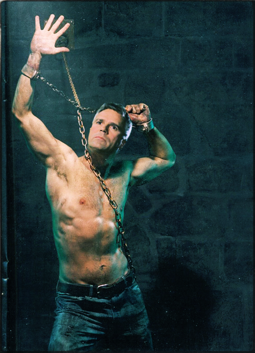
And there you have him!
There are many other things I could have done to this manip to tweak it for a more realistic look such as skewing the head, changing the shape of the thumb to look more like Jack's/RDA's, but this is pretty much the basics of how I photomanip in PaintShop Pro X3. Everyone develops their own way of doing things so this is by no means a tight list of steps. Have fun exploring all the different ways you can create an image with all the tools/toys at your disposal!
<3 <3 <3


